
“I feel like I can reach my health goals easily with Wellframe. I feel connected, and I know just what to do to stay on track with my health.”
- Wellframe User, 2015
ROLE
Product Design Lead
PROJECTS
Patient-Facing Mobile App
Clinician-Facing Dashboard
Style Guide / Company Branding
Company Website
Client Services Material
From April 2015 to November 2016, I led the Design team at Wellframe, a health-tech company building a platform to give better care for those with critical and chronic health conditions. Our platform consists of an app for the patients, alongside a dashboard for the care managers. I joined the company as the sole product designer, helming both UX and UI execution, providing documentation for developers, and asset prepping for all systems. I managed my time with respect to 3 platforms’ sprint cycles to ensure that I never blocked the mobile teams or the web team, and to do visual/flow QA before monthly releases.
It's all been a robust exercise in personal organization, communication, and wearing multiple hats. I've always held firm to the belief that startups should be "trial-by-fire" companies, where you get a lot of difficult responsibilities, but you also gain an invaluable amount of experience. This differs from the segmented work at big companies, or at an agency where projects are fast and usually aren't carried through multiple iterations in the field after going live. Working as part of a team that cares about the whole product has been fulfilling. It's great to know that we are creating value, not just in dollars for our customers, but in quality of life for our users.
MOBILE APP - IOS & ANDROID


With the mobile app, the main challenge was to make an engaging, intuitive app for users whose ages averaged 65+. In some instances, Wellframe was the first time a user had tried to navigate a smartphone. As a result, what the user is supposed to do at any given moment had to be extremely clear, with large, obvious call-to-actions.
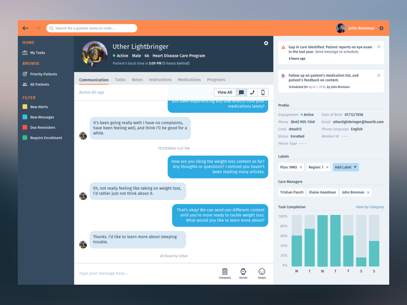
DASHBOARD FOR CLINICIANS / CARE MANAGERS

The evolution of the dashboard has been wholly user-driven. As a benefit of having live accounts, many of which were located in Boston, I was able to go to hospitals and interview the Care Managers that use our software on a daily basis.
We discovered that the main feature that kept patients coming back to Wellframe was 1-1 communication with their care manager, and developing a relationship there. As a result, we expanded the chat section for V2 (below), placing informational widgets on the right. The newest version (above) cleans up the navigational sidebar, and also improves the organization of the informational panels while reducing the width of the messaging area. By doing so, we save useful space while keeping messaging central to the platform. All informational sections were also moved to the right panel, so that the care manager never has to navigate away from the central messaging section to review patient information.
Version 2 - Chat section moved
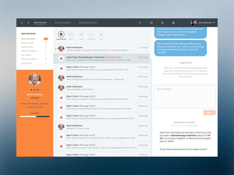
Version 1 - Inbox-styled dashboard
BRANDING / STYLE GUIDES / WEBSITE
At Wellframe, I also had the opportunity to create the style guides associated with both the mobile and dashboard products, and also the overall company brand. I worked on two iterations of the company website, and also created Wellframe™ iconography to be used in our sales material.


